trdsql graph
trdsql does not have a graph creation function, so when you want to create a graph, you will need to use another tool to create it.
Drawing with Excel or LibreOffice is the standard, but here we introduce how to draw a graph with marianogappa/chart.
marianogappa/chart is made in Go and works on many platforms, drawing data received from standard input to the browser.
It is not suitable for complex graphs, but you can draw simple graphs with just a few options.
The data given to chart depends on the graph you want to display, but it is 1 or 2 columns of data.
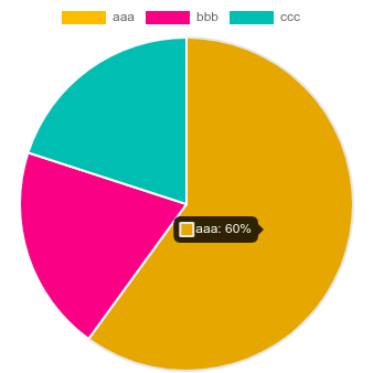
For example, the default pie of chart aggregates data that looks like the following strings and creates a pie chart.
(The browser opens and displays)
For example, using this to graph the requests of the logs used in log aggregation will look like this.
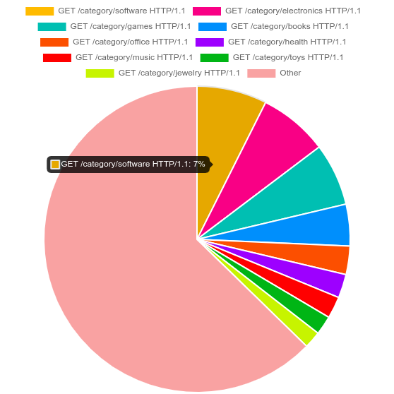
In other graphs, the first column is the x item name, and the second column is given as the value. The default is to receive tab-separated data, so output it in tab-separated format.
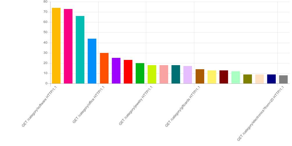
When you change the requests with the most log aggregation to the TOP 20 and output it, it will look like this.
marianogappa/chart uses Chart.js to draw graphs. Chart.js itself will draw if you provide simple JavaScript, so it is better to use it directly if you want to draw a slightly more complex graph.